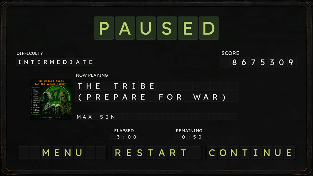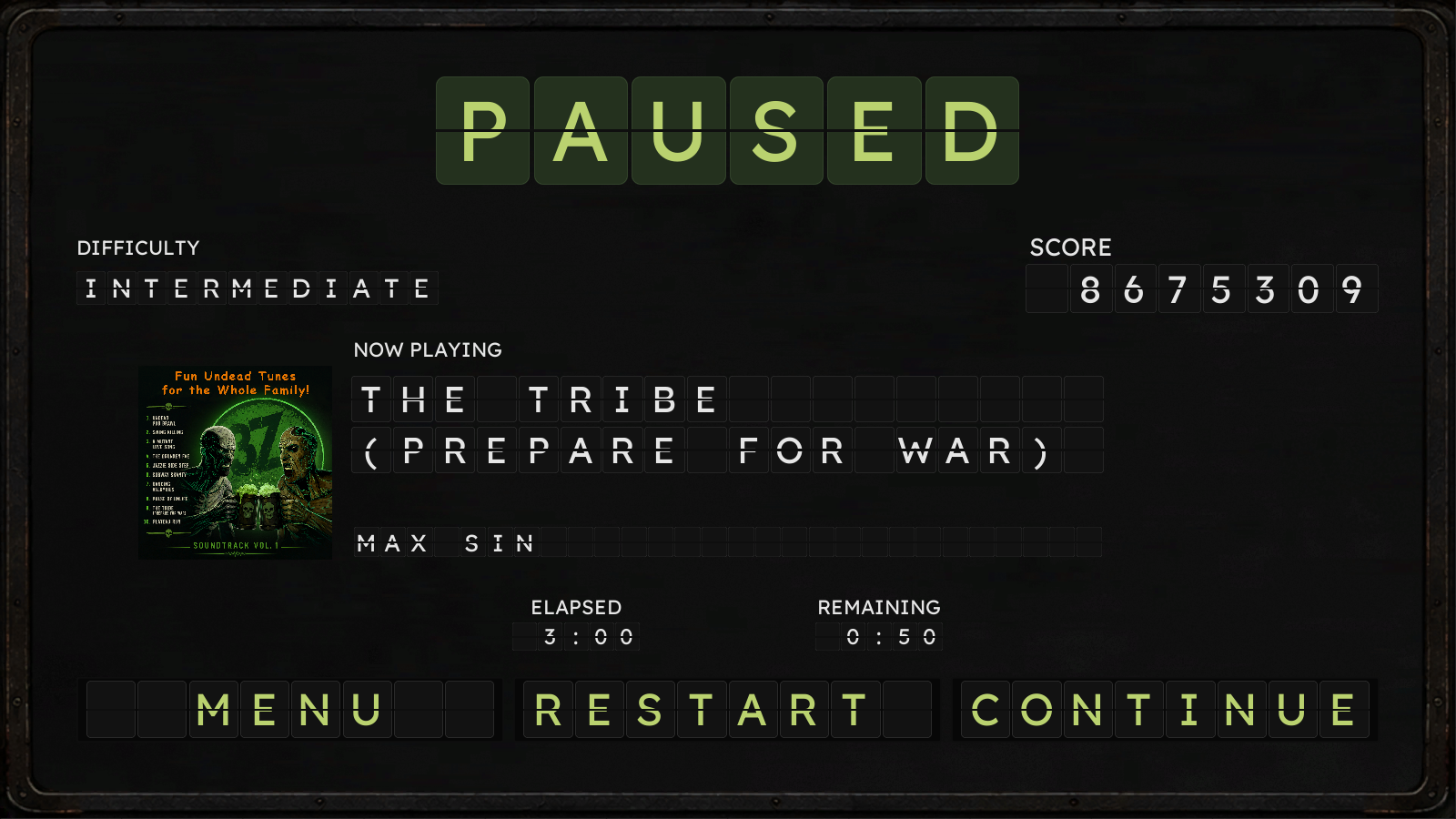
When we committed to the old‑subway‑tunnel aesthetic for 3Z Incursion, we knew the billboards and menus needed to feel like part of that world. Digital screens looked too clean. Plain text felt too modern. But split‑flap displays – the clacking, gritty boards you’d see in old stations – fit perfectly. They gave the environment texture, personality, and a sense of place that matched the tunnels.
There was just one problem: no existing font or asset captured what we needed. Nothing was readable enough in VR, accessible enough for all players, or flexible enough for our menu system. So we built our own split‑flap widgets from scratch.
Accessibility shaped every decision. Making something more accessible for one group almost always improves it for everyone. That meant choosing a font with strong VR visibility, dyslexia‑friendly character shapes, and clear silhouettes. It meant selecting color palettes that reduce eye strain and maintain contrast across lighting conditions. And it meant giving players control.
Our split‑flap text system includes a toggle that disables the “split” effect entirely. While the aesthetic fits the world beautifully, some players may find the split distracting or harder to read – so they can turn it off. The pause‑menu screenshots show both versions: split enabled at the top, split disabled at the bottom.
This approach keeps the subway vibe intact while ensuring every player can tailor readability to their needs. Style and accessibility working together – exactly how it should be.